Deep Funding Machine Prediction and Cartography with the Omniacs.DAO
Our submission to the Deep Funding Mini-Contest leverages a high level feature embedding of the funded repositories in combination with standard best practices for modelling tabular data presented with a novel “Funding Map” for added insight into the funding performance of the projects on interest.
- Part 1: Submission under “Omniacs.DAO” on Hugging Face with an MSE of 0.0145
- Part 2: Submission under “Omniacs.DAO” on CryptoPond with an MSE of 0.0564
- Code and Data: GitHub - OmniacsDAO/deepfundSubmission
Executive Summary
- We used a combination of Github repo features in addition to an Nomic embedding representation of the repo readme files as inputs into a grid search optimized gradient boosting machine to achieve a top 10 placement on both part 1 and part 2 of the mini-contest.
- We then applied linear and non-linear dimensionality reduction techniques to the embeddings to generate “Funding Maps” that highlight not only groups of similar repositories but also their funding amounts, highlighting both under and over performing projects.
- As a contribution to the Deep Funding community, we open sourced all of our post processed data for easier replication of our modeling efforts. Our code has also been published as well.
Approach
In a quick “cookbook” format, our approach to developing models first consisted of collecting both training datasets from the HuggingFace and CryptoPond platforms. We then supplemented the data with information from the Open Source Observer using Bigquery, as well as, both procuring the project readme.md files via the github API and then extracting a vectorization of the text using the nomic-embed-text:v1.5 embedding model. We then utilized a grid search to find the optimal hyperparameters for a standard gradient boosted model. This approach resulted in top 10 placements on both leaderboards at the time of writing.
Deep Funding Cartography
To take our results one step further we leveraged manifold learning as a dimension reduction technique to create what we are calling a “Funding Map” of the projects included in the training set, but mapped out by the similarity of their readme.md files. These readme files, when vectorized, can serve as quantitative proxies for similarity once combined with a distance metric like Euclidean distance. Before the creation of the map; however, we had to first derive a proxy ranking of the funding performance of the repos. This was done by using a simple sum of the predicted weights from our model.

This allowed us to apply a simple coloring scheme where the top 20% are labeled green while the bottom 20% are labeled red. The resulting “Funding Map” is below.
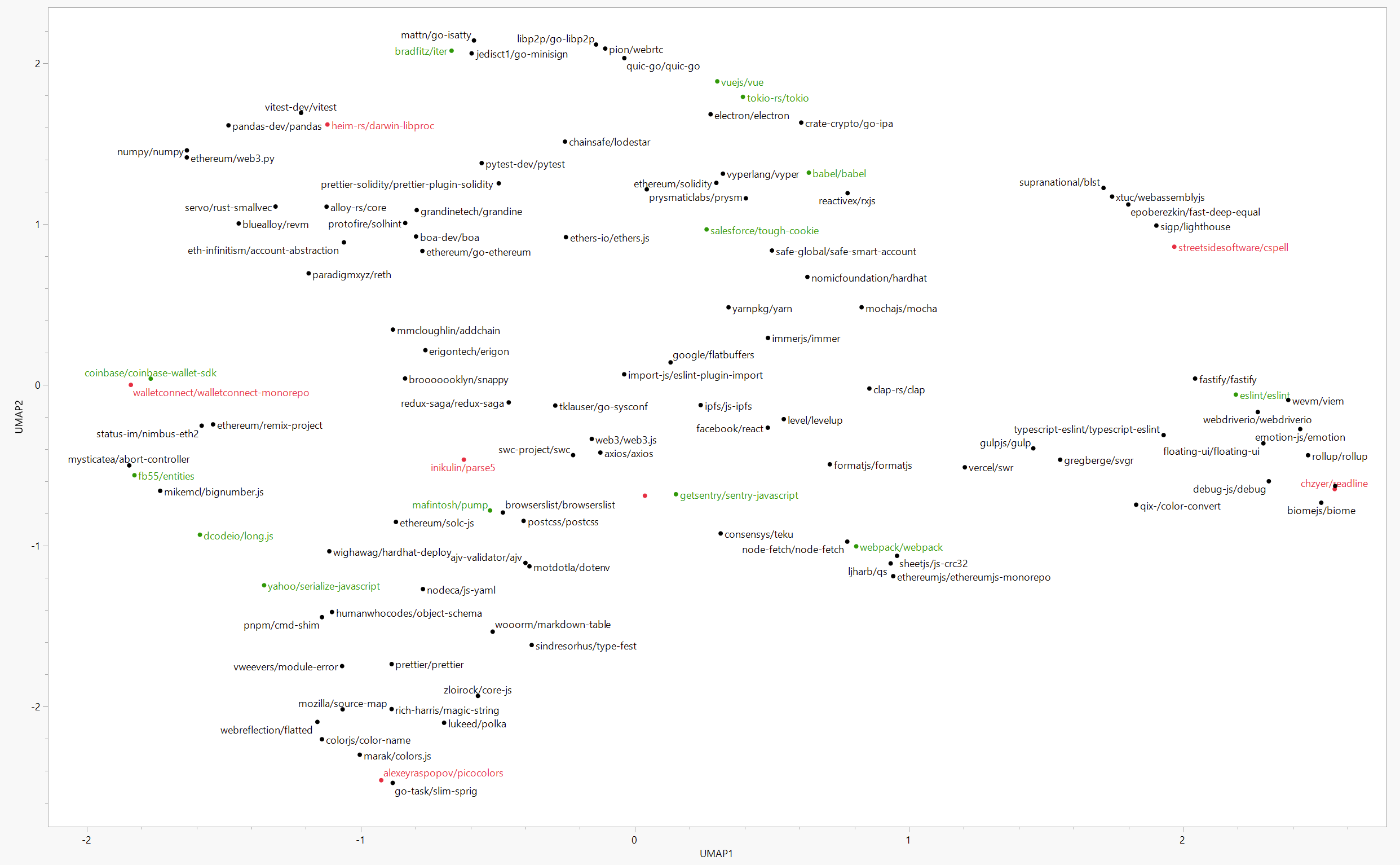
One really cool insight highlighted from the map is that related repos don’t necessarily receive the same amount of funding.

In the section of the map above, the Coinbase Wallet SDK is highlighted as a green projects, while the WalletConnect monorepo designed to “Open protocol for connecting Wallets to Dapps” severely underperforms. We can see this not only from the raw scores…
… but also the head to head match-ups in the training data.


We took some extra time to bring our analysis to life by creating an interactive version of our Funding Map so others can explore the donation space we derived.

In conclusion, we think our modeling efforts and statistical visualizations gets us all one step closer to more deeply understanding public goods funding and how we can better allocate capital to what matters in the space!